Oklahoma Call for Reproductive Justice
The Oklahoma Call for Reproductive Justice fights for Reproductive Justice rights for all. They are doing the massively important work of tracking and lobbying for good legislation while trying to not lose ground with bad legislation. In Oklahoma, that’s a full time job and a half. The OCRJ is made up of incredible volunteers who dedicate so much time and energy to making Oklahoma a better place, and they have had a direct impact on the kinds of legislation Oklahoma passes.
When we started work with OCRJ, they were named “The Oklahoma Coalition for Reproductive Justice.” They knew this was a mouthful, but they didn’t know the extent to which this was alienating people. We conducted a study (across many demographics and regions) over the effectiveness of a their name. We determined that it had to change, but this was a challenge because they had developed equity with the acronym, OCRJ. Additionally, they didn’t want to give up their domain name ocrj.org. We evaluated names that maintain the acronym and the web address, but more accurately reflect who they are. Our biggest concern was that they were not a coalition at all, but rather a grassroots group of organizers and individuals. After six months of studies, workshops, tears, and different name explorations, we finally landed on the name The Oklahoma Call for Reproductive Justice. This was a huge win for them— it has really helped them to strengthen how they communicate to Oklahomans.
︎ Their old logo incorporated a scissortail, but no one in the org knew why or what meaning it had other than being the (vastly over-used) state bird. Their visual language leaned heavily on traditional feminine tropes, which isn’t inclusive in a movement for reproductive justice for all.
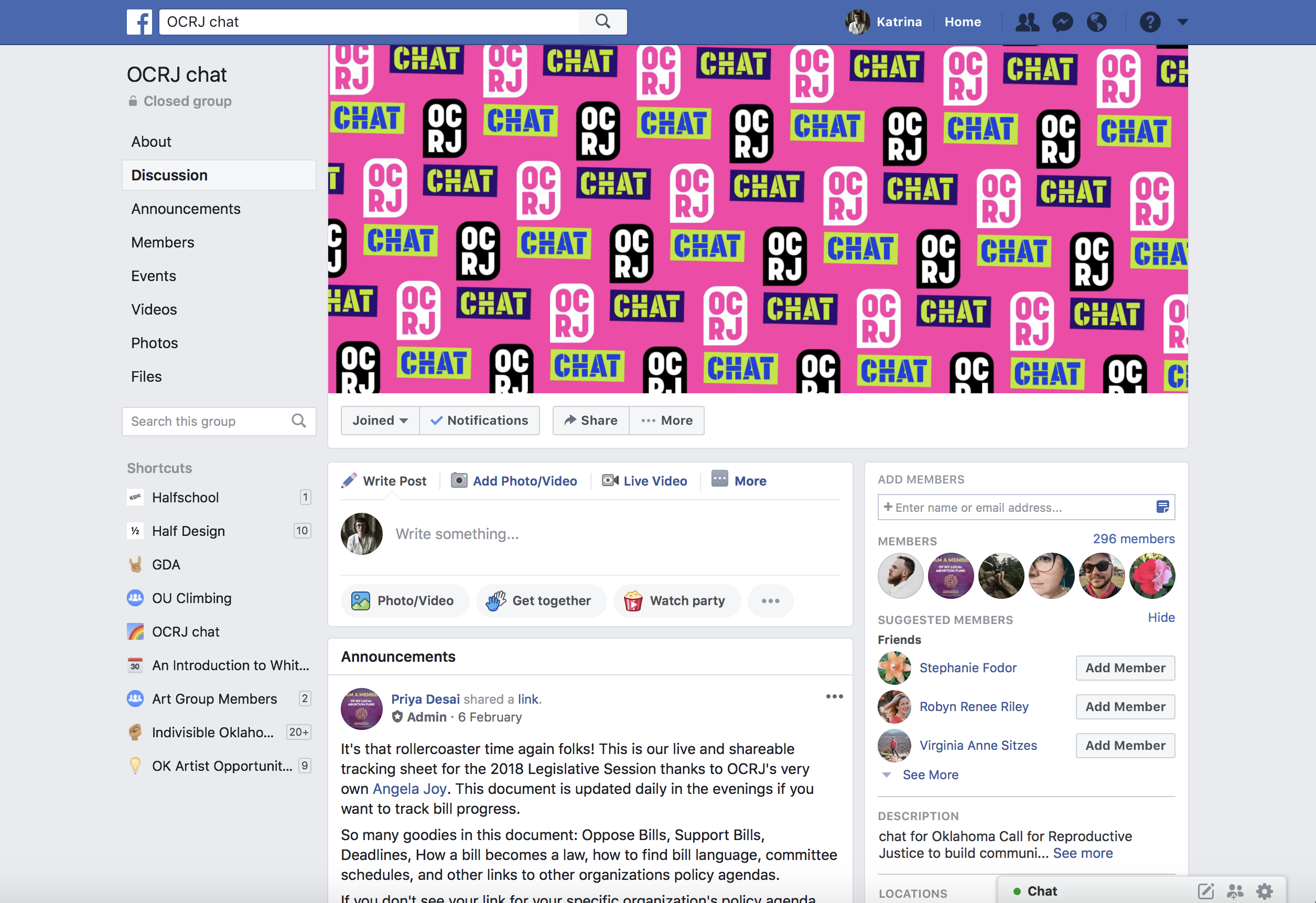
︎ Their new logo references a speech bubble that ties into their name change.

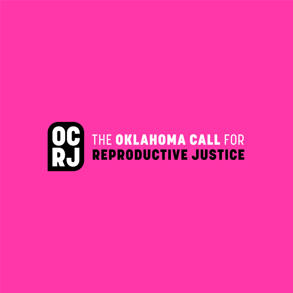
We designed a speech bubble device to contain the mark. This reflects the “Call” in their new name, symbolizing that they don’t just oppose bad bills, they call for better things and support good bills. This was one of the main goals they had—they wanted to be seen as for things, not just a reactionary group. We created a color system for them that uses three variants of three colors (9 colors total), and selected Korolev and Korolev Military Stencil for the brand fonts, inspired by hand-made vintage activist signs. Because of the nature of their brand fonts, we were able to make actual stencils for them to use when they make their own signs. This translates into a lot of money saved for their organization, and a fun way to get people involved in protests.


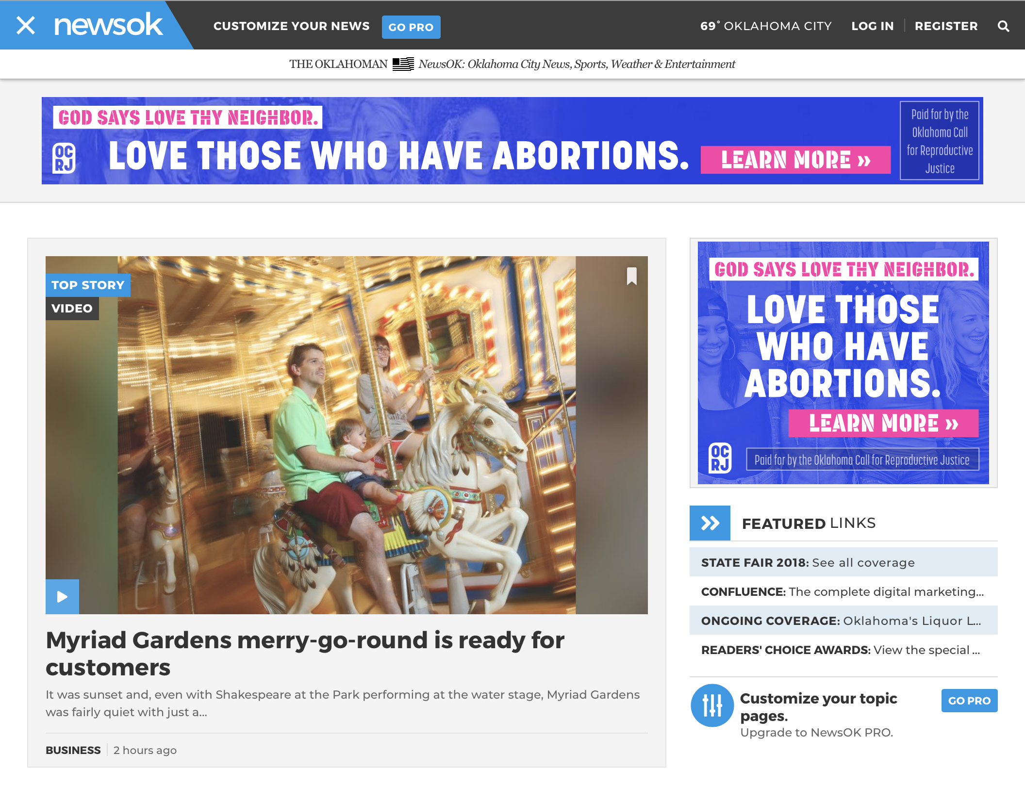
︎ The identity flexes well into the digital space, and was used to develop an ad campaign targeting people of faith, as well as yearly calls to action around legislative bills.
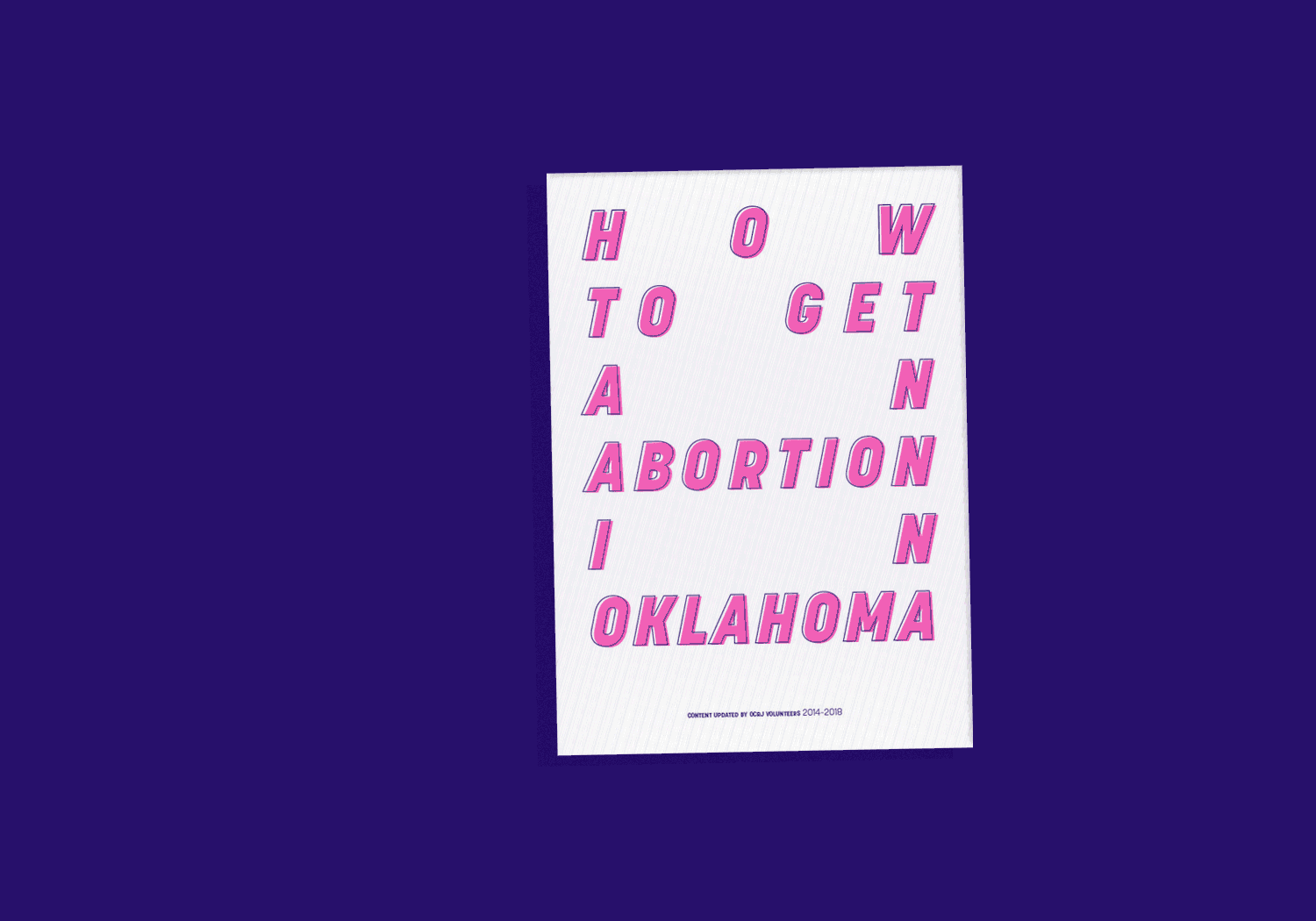
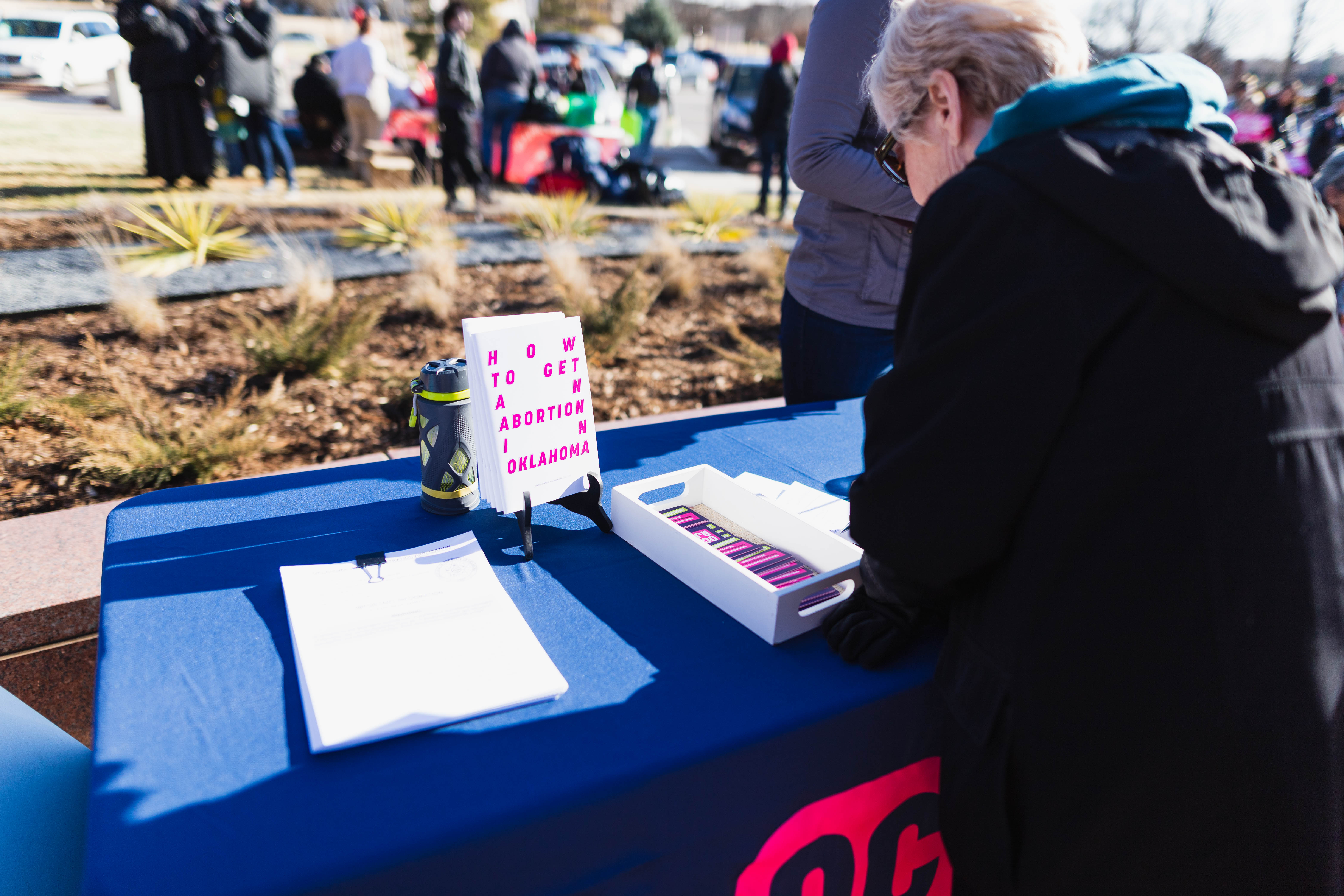
︎ I designed a zine that will eventually be riso printed that will help people know how to get an abortion in and around Oklahoma The content was compiled by Violet Rush.
Work done at Half Design in collaboration with Nate Ward